Skip to content
Tal Koren
Home

Experiments

Small explorations into interfaces, tools and ideas that didn't need a roadmap.

01 / prototype, not shipped

Live component documentation

What if product documentation could behave more like Storybook?
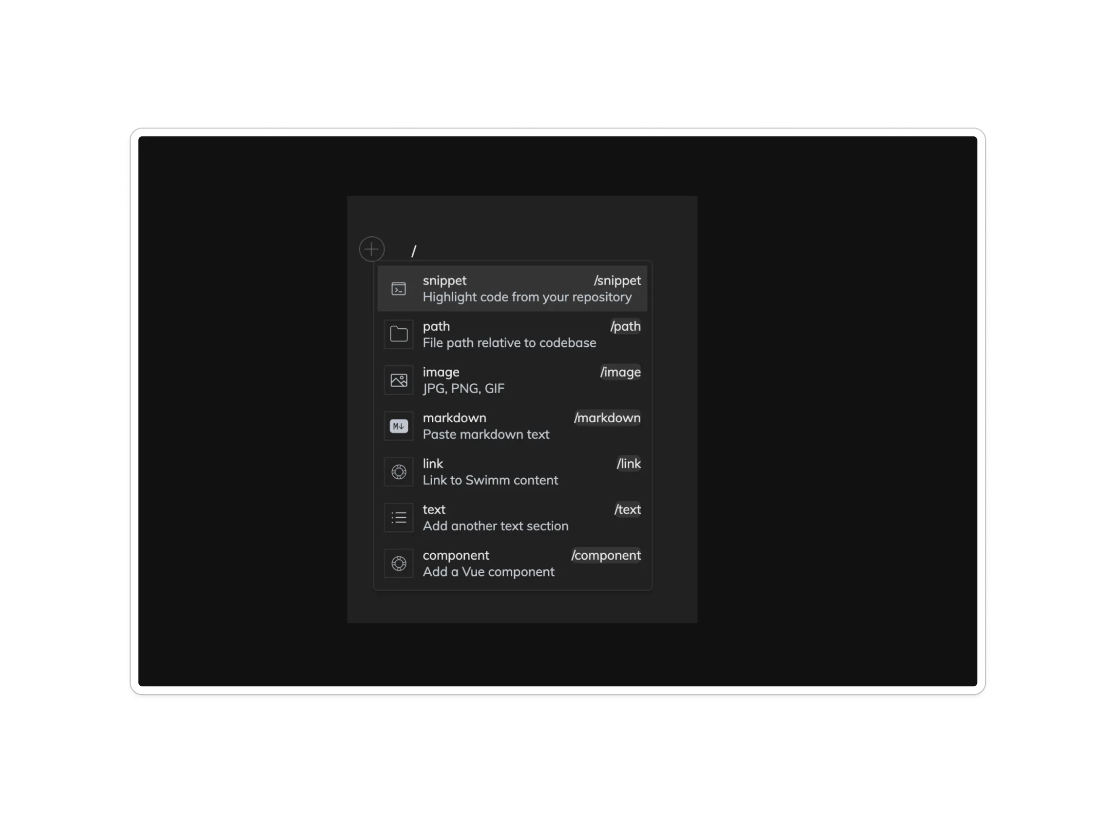
Swimm's document editor slash menu, including an option to insert a live Vue component.
The proof of concept: a component becomes something you insert, not something you describe.

An internal Swimm research experiment exploring how interactive component examples could live directly inside documentation.

I looked at how tools such as Storybook approached interactive component documentation, explored where the same idea might apply inside Swimm, and built a simple proof of concept to make the question concrete.

The goal was discussion and research rather than production — a way to ask how component demos, documentation and source context might coexist on one surface.

Retrospective model

Code

the source being documented

Live component

the thing actually running

Documentation

the explanation around it

Context

where it belongs in the product

one surface instead of four places
Explanatory diagram of the concept explored, drawn for this page.
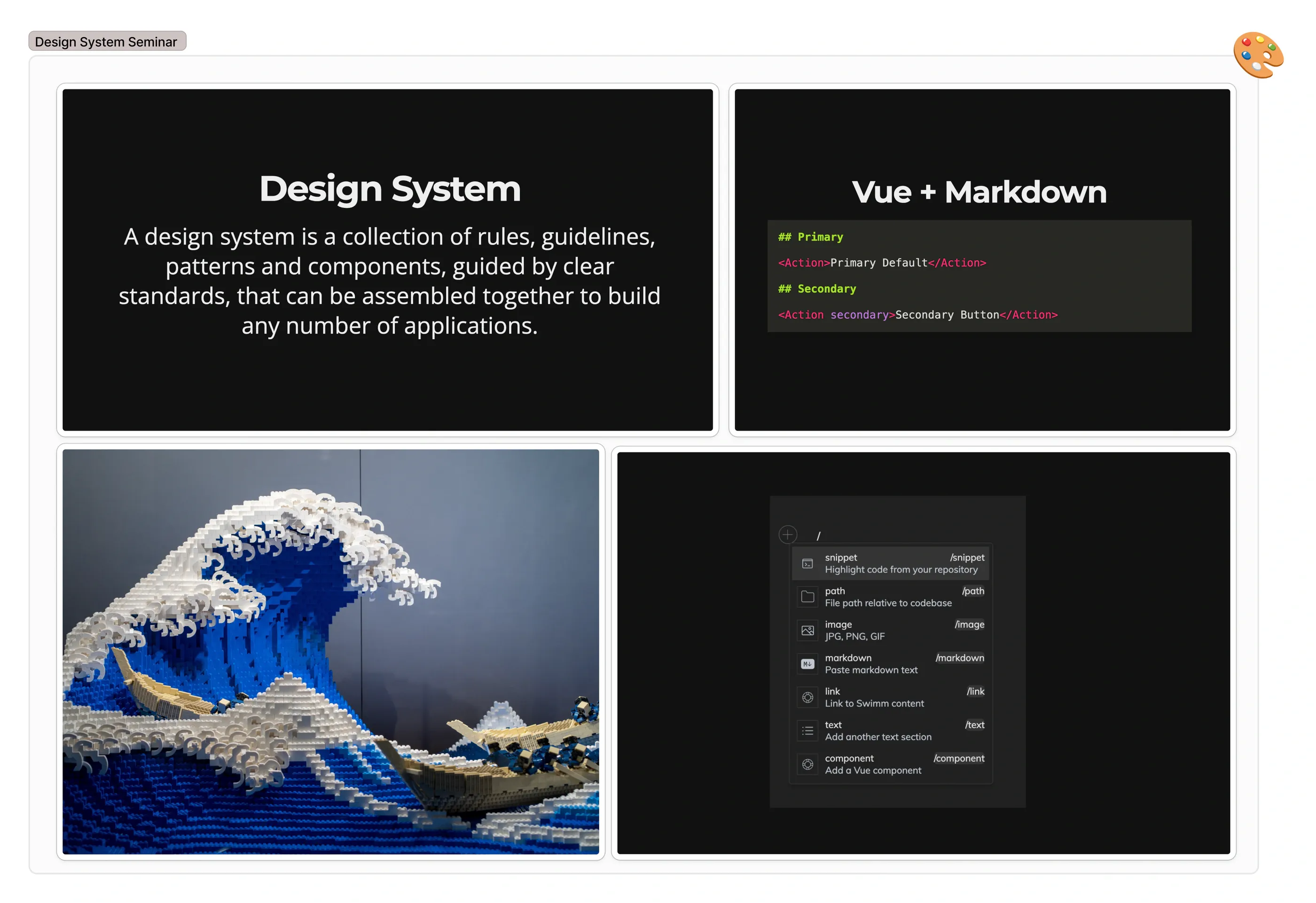
Slides from an internal design system seminar, covering design system fundamentals and combining Vue components with Markdown.
From an internal seminar on design systems — where the Vue-plus-Markdown idea came from.

02 / figma study

OP-1 interface study

Recreating a piece of hardware UI in Figma to understand what makes it feel so physical.

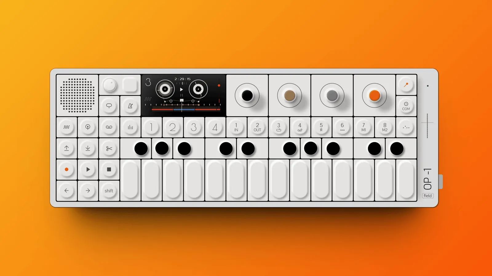
The OP-1 Field rebuilt in Figma: speaker grille, screen, four coloured encoders and the full key bed, rendered on an orange background.

Teenage Engineering products have always interested me because their interfaces blur the line between industrial design, graphics and interaction.

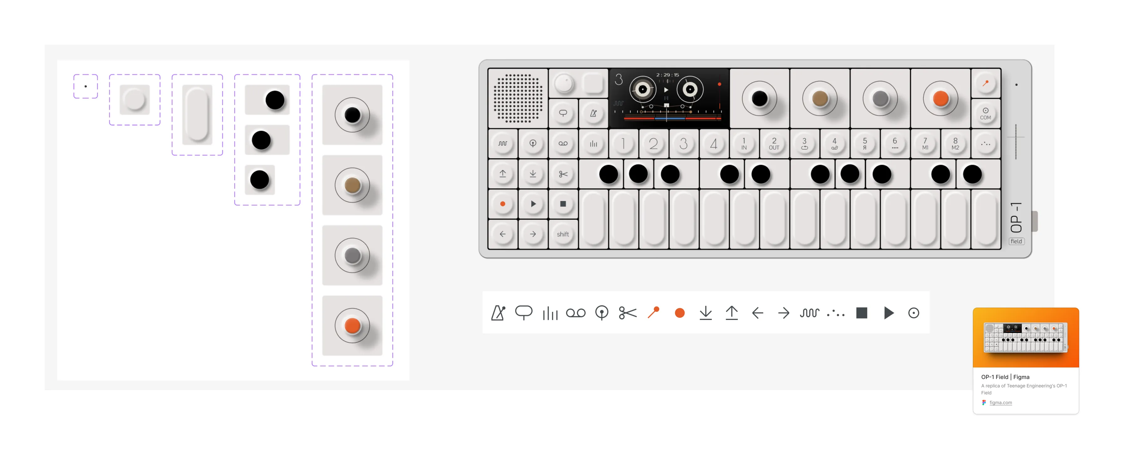
I recreated the OP-1 Field in Figma as a visual and interaction study: examining proportions, controls, hierarchy and how physical affordances translate into a compact digital system. Every control is a component, down to the icon set.

The Figma file: control components broken out on the left, the assembled interface and its icon set on the right.
Controls pulled apart into components on the left, reassembled on the right.

Hardware has constraints the web decided it didn't need.

Rebuilding the panel makes the discipline obvious. Almost all of it resolves to one grid and a small set of components with variants — the character comes from proportion and restraint, not ornament. But the more interesting part is what the object is doing that a browser almost never has to.

  • 01

    A surface that cannot grow

    The panel is finite. Nothing can be added in a later release, so every function had to win its place against every other one. Software is never under that pressure — there is always room for one more panel — which is most of why software sprawls and this doesn't.

  • 02

    Colour as an address

    The encoders aren't tinted for decoration. Colour is how you refer to them: the first parameter is the same knob in every mode, and you find it without reading. A labelled dropdown carries identical information and none of the muscle memory.

  • 03

    State you can read without looking

    A knob's position is its value, permanently, from across the room. Screen controls lose that the moment they scroll out of view, which is why interfaces spend so much layout restating what a physical object simply is.

  • 04

    The screen is not the interface

    The display is small on purpose. It reports on the controls rather than replacing them. Most software inverts this until the screen becomes everything and the controls become pictures of controls.

The part people usually copy is the part that doesn't translate. A knob drawn on a screen is worse than a slider: you lose the grip and gain a metaphor. Skeuomorphism took the surface and left the reasoning behind.

What does transfer is the discipline. Deciding what earns a permanent place. Letting one thing mean one thing everywhere. Being willing to ask someone to learn a little, in exchange for density and character — a trade most product interfaces refuse by default rather than by decision.

A Figma study. Nothing here was built in code.

Open the file on Figma