Swimm
Rethinking navigation for a developer product
From navigating files to navigating knowledge.
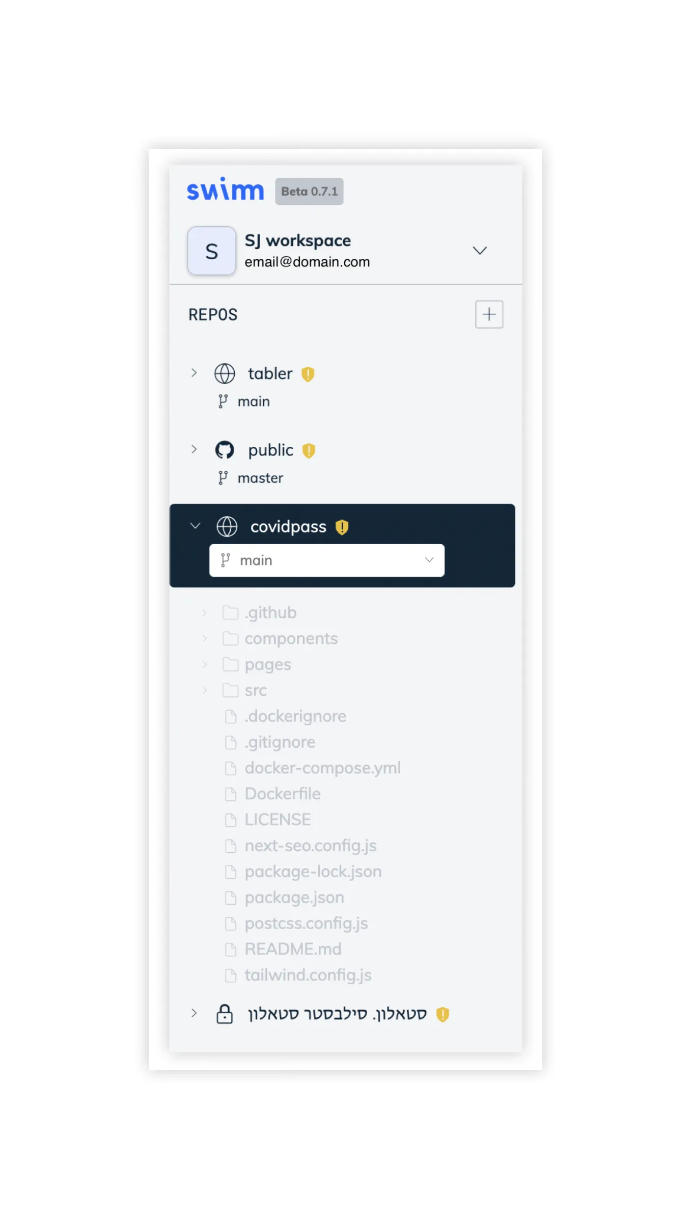
Swimm's original sidebar reflected the structure of the repositories it documented. Users navigated repositories, branches and file trees to reach documentation connected to code.
That model made technical sense, but it increasingly required users to think about where information lived before they could find what they needed.
01Problem
The information architecture mirrored the codebase. Users didn't always think that way.
Reaching a document meant reproducing the shape of the repository in your head first: which repo, which branch, which folder, which file, and only then the documentation attached to it.
The mismatch wasn't that the model was wrong. It was that the product asked for a path when the user arrived with a question.
Retrospective model
What the product asked for
Repository
Branch
Folder
File
Related documentation
What the user was thinking
I need documentation about X
five decisions to answer one question
02Exploration
Exploring a different hierarchy
The redesign wasn't a single before-and-after exercise. We explored several information architectures, including versions that remained heavily Git-oriented and others that retained the repository tree in different forms.
I created and iterated on the interface concepts in Figma with Design and Product, observed user interviews, and used multiple rounds of A/B testing and feedback to refine the direction.
Retrospective model
AGit-first
Kept repository and branch at the top of the hierarchy.
BTree retained
Kept the file tree, but surfaced documentation alongside it.
CProduct-level
Replaced the tree with destinations, moving Git into context.
three of the substantial directions explored
03Hierarchy
Hierarchy
The structure stopped describing the codebase and started describing the question.
Retrospective model
Before
- Repos
- Branch
- Files
- Docs
structure of the codebase
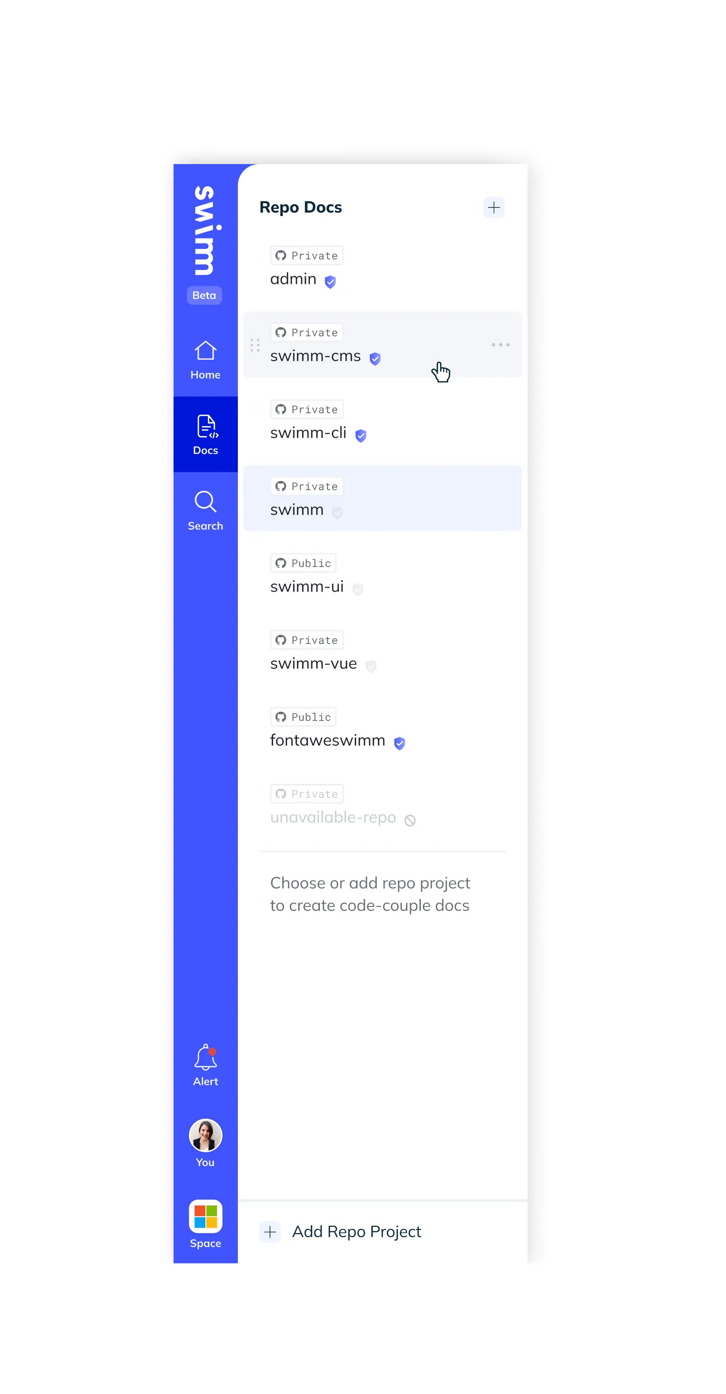
After
Home
dashboard / overview
Docs
documentation across repositories
Search
find information across documentation
shape of the user's intent
Repositories and branches still exist. They became context rather than navigation.
04System
Simpler navigation, more complex system underneath
Simplifying the user-facing information architecture did not simplify the data model. The interface still had to reconcile multiple repositories, branches, documentation that differs between branches, permissions, unavailable repositories, cloud entities and GitHub-backed entities — while loading large repositories and large documentation sets without stalling.
The user shouldn't have to understand the complexity of the underlying data model simply because the frontend has to.
Architecture overview
Visible UI
Home
Docs
Search
Underlying system
- repositories
- branches
- documents differing between branches
- permissions
- unavailable repositories
- cloud entities
- GitHub-backed entities
- loading large repositories
- large documentation sets
- virtualized lists
- asynchronous states
05States
States
Three destinations at the top meant every entity underneath had to resolve to a predictable behavior: whether it is reachable, whether it is branch-aware, where it came from, and what the interface does when any of that is missing.
Example state model
| Entity | Available? | Branch-aware? | Permission? | Source | UI behavior |
|---|---|---|---|---|---|
| GitHub repository | Yes | Yes | Required | GitHub | Full navigation |
| Cloud document | Yes | No | Workspace | Cloud | Listed everywhere |
| Unavailable repository | No | — | — | GitHub | Shown, not enterable |
| Private repository | Conditional | Yes | Required | GitHub | Hidden without access |
| Different-branch document | Conditional | Yes | Inherited | GitHub | Marked out of branch |
06Outcome
Outcome
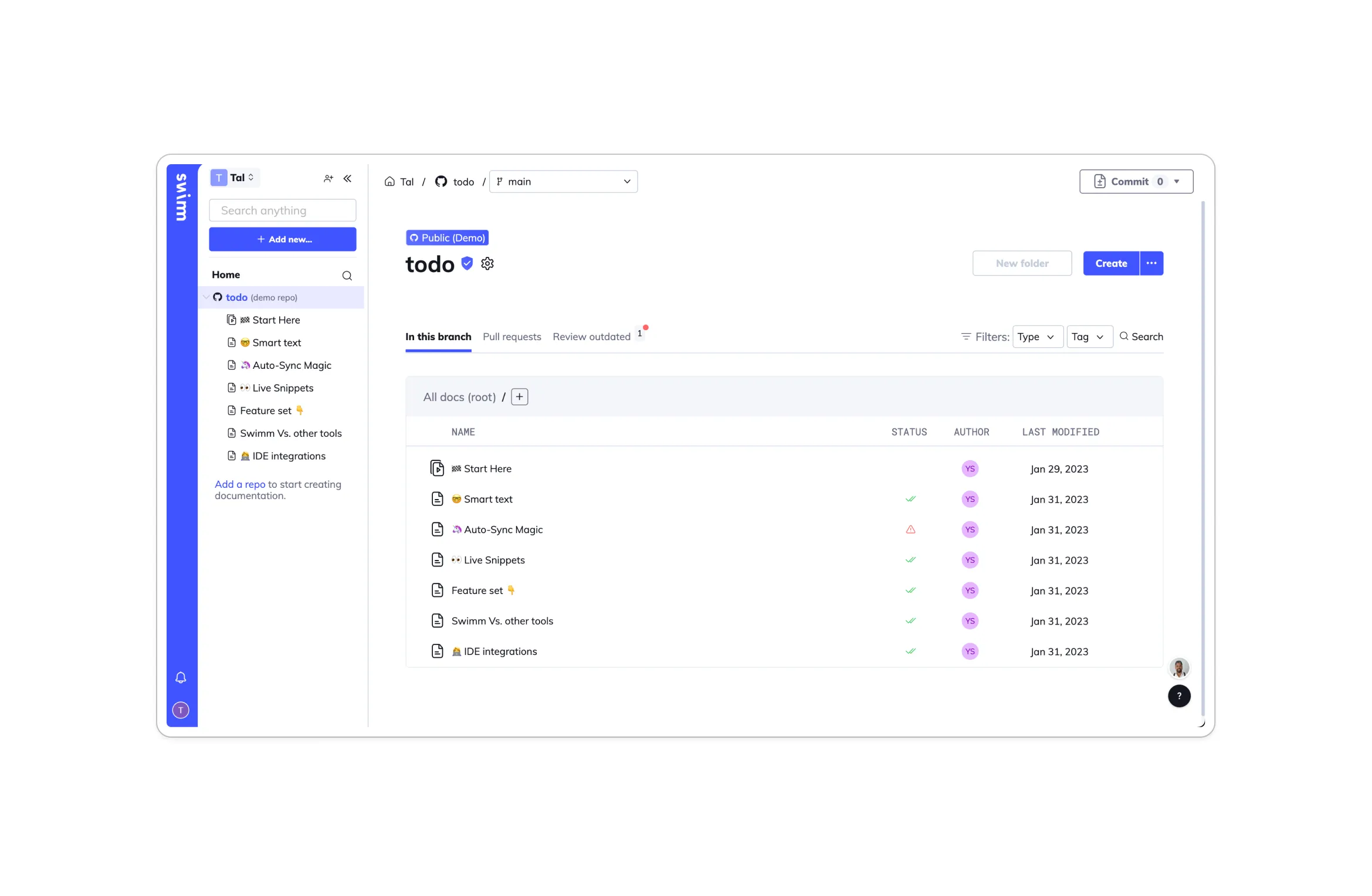
The final direction made the product easier to understand at first glance: Home became the product entry point, Docs became the place to browse documentation, and Search offered a direct route to information across repositories.
Git remained an important part of the underlying model, but it stopped dictating every step of the user's navigation.
The redesign moved complexity out of the user's path without pretending that complexity didn't exist.